Your venue decides which of these palettes works, because the same color shifts a lot between a screen and a room, and an indoor space or evening lighting can change it again.
The palettes here run from pastel pink and blue to emerald, sapphire and burgundy, and the safest versions of each follow one formula: 1 anchor color, 2–3 complementary tones and a neutral to ground them.
1. Pastel Pink & Blue
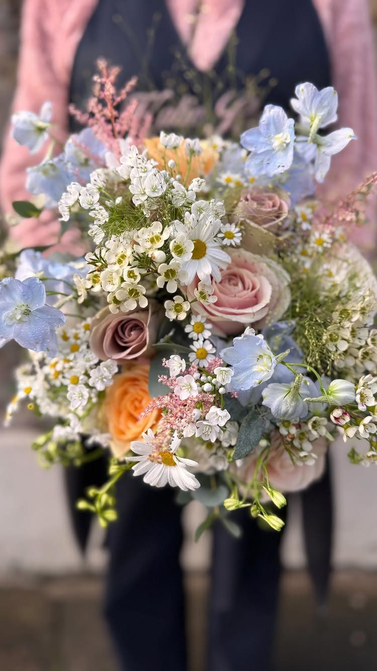
Pastel pink and light blue sit close enough in tone that a bouquet like this reads as one soft color, with white daisies keeping it from going sugary.
For a spring ceremony, I’d carry that same blend into the boutonnieres and a few table arrangements, and nowhere else.
Pick one color to lead and let the other support. Mostly pink with blue accents looks warmer; mostly blue feels cooler and a little more modern.
2. Sage Green and Champagne Wedding Color
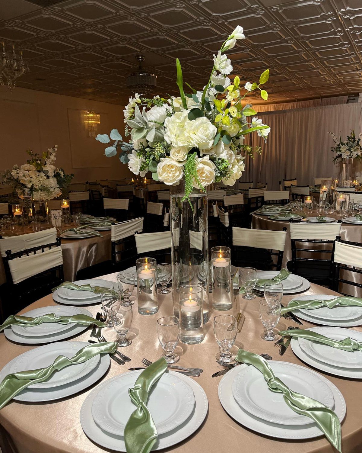
Champagne linens with sage napkins make a calm, grown-up table, and white flowers with greenery keep it from feeling flat.
I like it because the 2 colors are muted enough that nearly any bridesmaid dress or suit shade sits comfortably beside them.
White plates are the right call with sage and champagne; they let the napkins and table linens carry the green instead of competing with it. Spend your flower budget on height in the centerpieces and keep everything else quiet.
3. Soft Yellow and Greenery Wedding Color
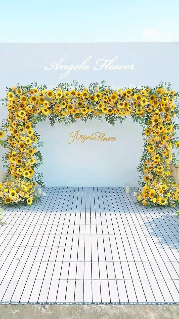
Sunflowers against a white wall with plenty of greenery give you yellow that feels cheerful rather than loud. An arch like this works as a ceremony backdrop or a photo spot, and the white behind it makes the color pop.
Use soft yellow in small doses elsewhere, like a few stems in the bouquets, and let the leaves do the filling. Greenery is the cheaper way to add volume, so lean on it.
4. Blush, Ivory, and Gold Wedding Color
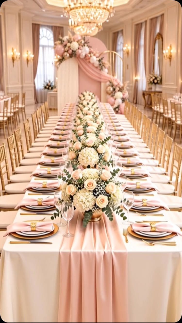
Blush, ivory and gold is the safest romantic palette for spring, and the gold keeps it from reading as plain pink. Gold chairs and a blush runner over ivory linens do most of the work on a long table.
I’d keep the flowers white so the table doesn’t tip into sweet. Choose one gold element to repeat, like chairs or flatware, rather than gilding everything.
5. Dusty Rose and Mauve Wedding Color
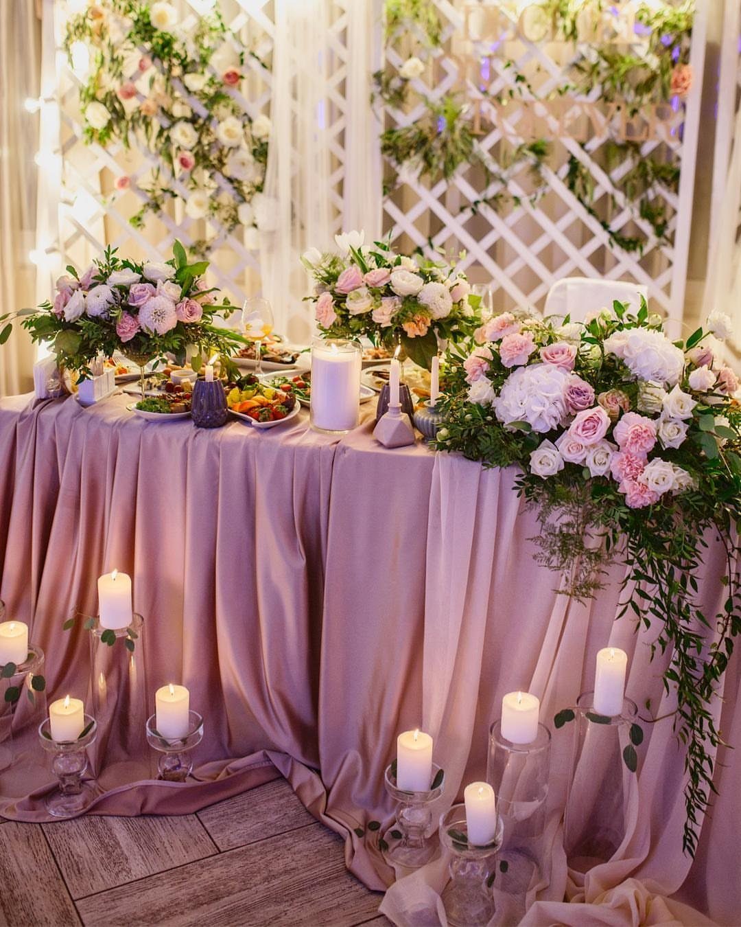
A mauve tablecloth with dusty rose flowers gives you depth without going dark, which spring venues with lots of white and greenery can use.
White pillar candles are a smart contrast, since they brighten the table and keep the pinks from muddying.
Drape the fabric in loose folds rather than pulling it tight; the shadows add richness for free. Mauve is the anchor, so keep the rose in the flowers.
6. Peach and Soft Coral Wedding Color
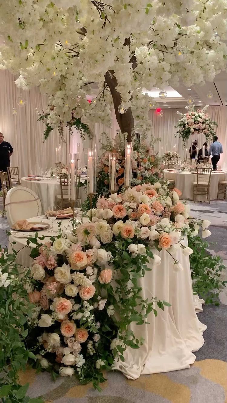
Peach and soft coral feel like late spring: warm, but gentler than an orange-leaning palette.
Keep the linens white and let the flowers carry the warmth. If you want a bit more punch, add coral in just one place, like the bouquet, so the room stays soft.
7. Pale Blue and White Wedding Color
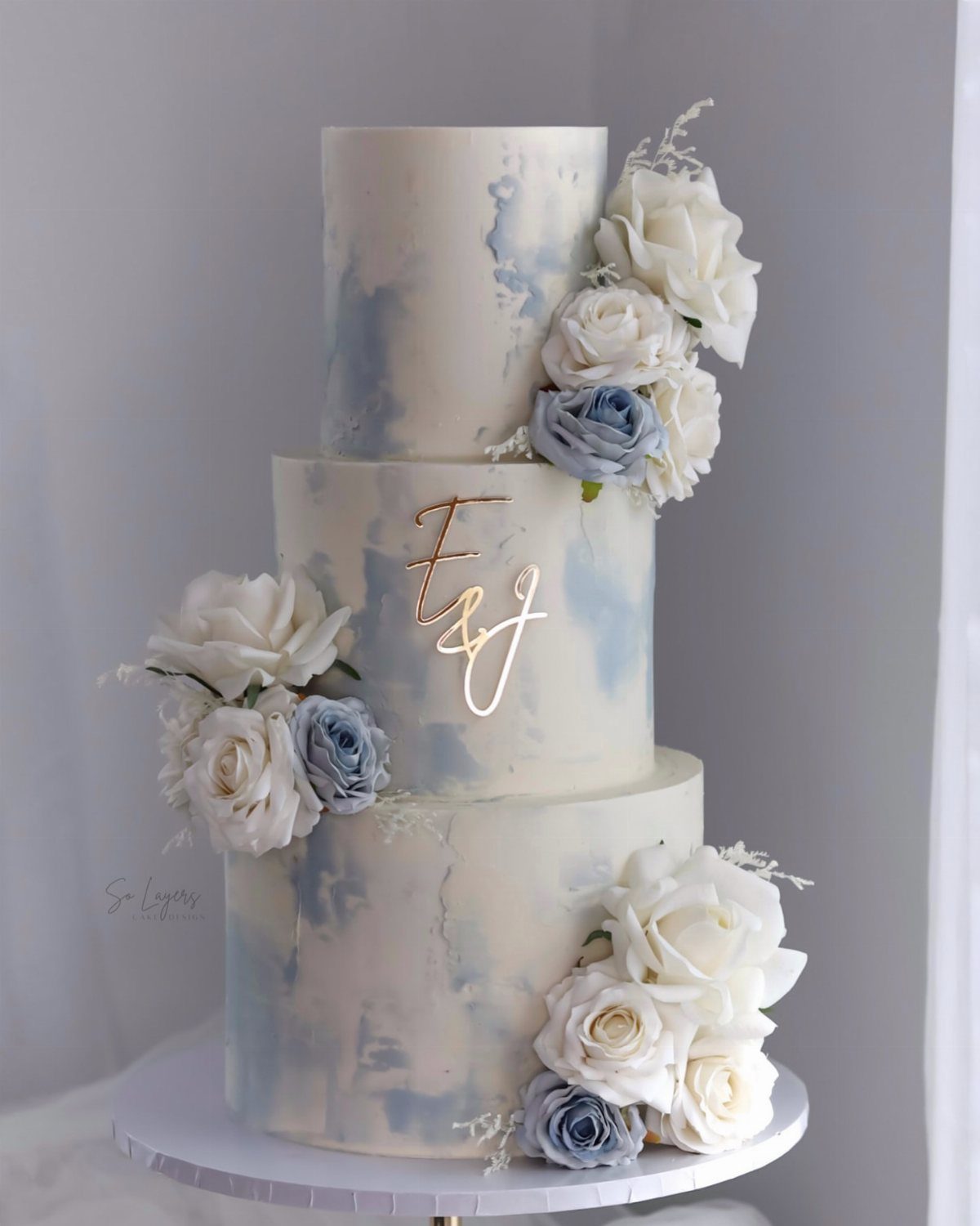
A white cake with pale blue watercolor washes and sugar roses in blue and white lets the color live in dessert rather than in the whole room.
Gold initials on the cake itself tie it back to the rest of the table.
Go white on the tablecloths and florals, which leaves the pale blue as the single soft note in the room. Have your baker match the blue to your invitations or one ribbon, so the colors repeat instead of competing.
8. Vibrant Pink and Green
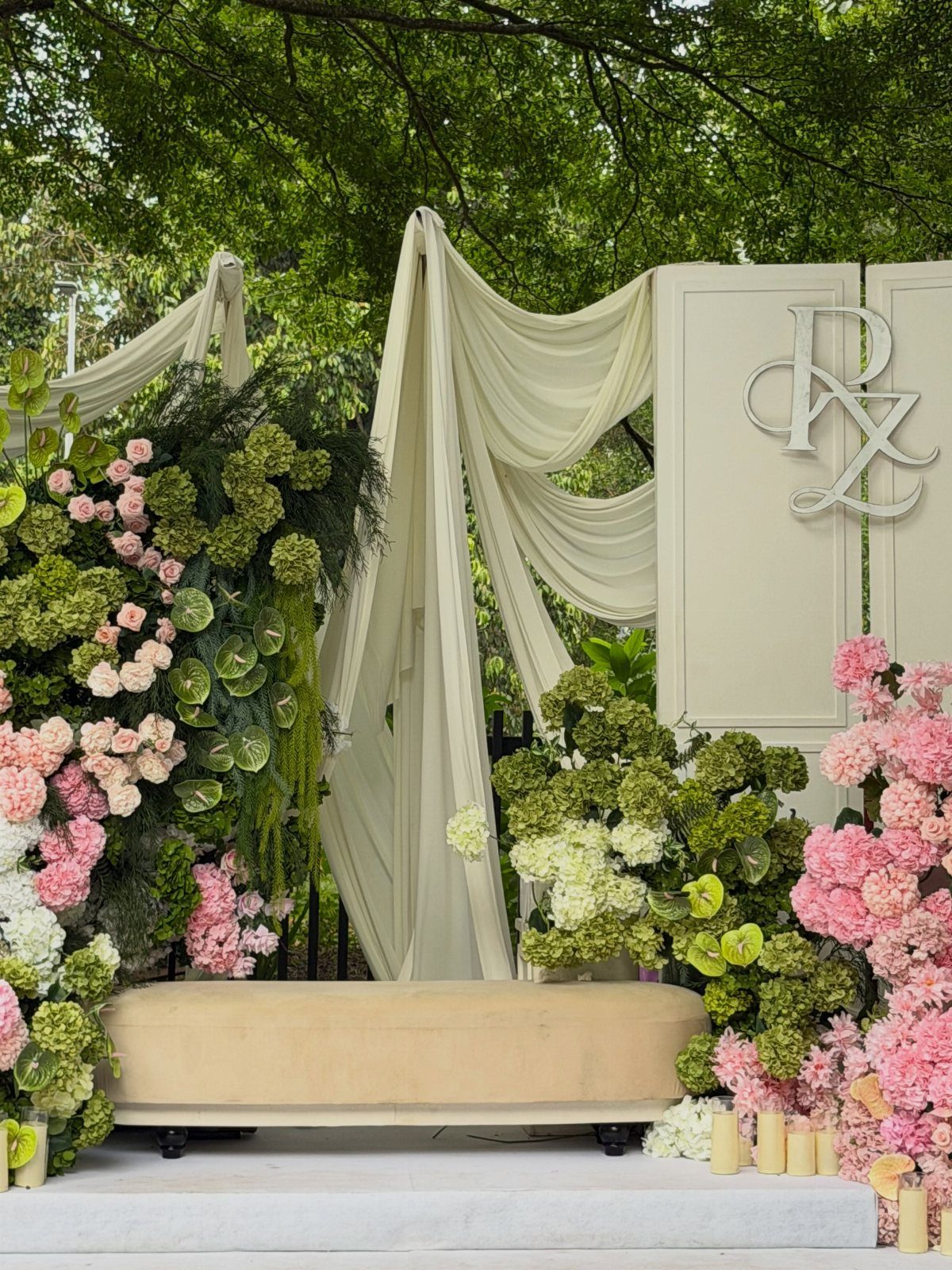
Hot pink blooms against deep green leaves feel like a garden in full swing, and ivory drapery behind them gives the color a calm place to land.
A backdrop like this works for a ceremony or a photo corner, especially outdoors.
Let the greenery fill most of the space, since it costs less than extra pink stems. I’d keep the fabric and any signage neutral so the flowers are the only loud thing.
9. French Blue, Peach and Ivory
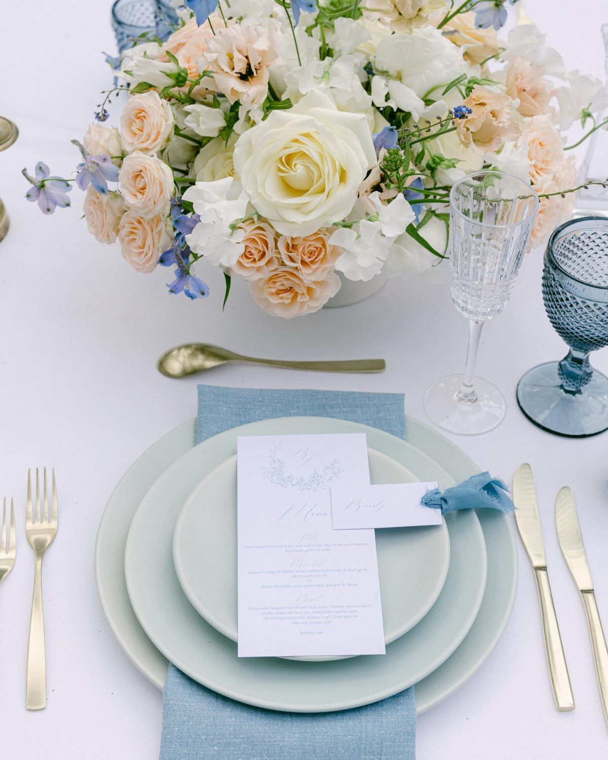
Blue glassware beside peach and ivory roses is a table that looks collected rather than matched. Gold cutlery warms the blue, and a menu card on a light blue napkin repeats it without adding more.
Pick French blue for the glass or plates, not both, or the table gets heavy. Keep the roses in peach and ivory only, so the blue stands out as the contrast.
10. Blush Pink and Burgundy Wedding Color
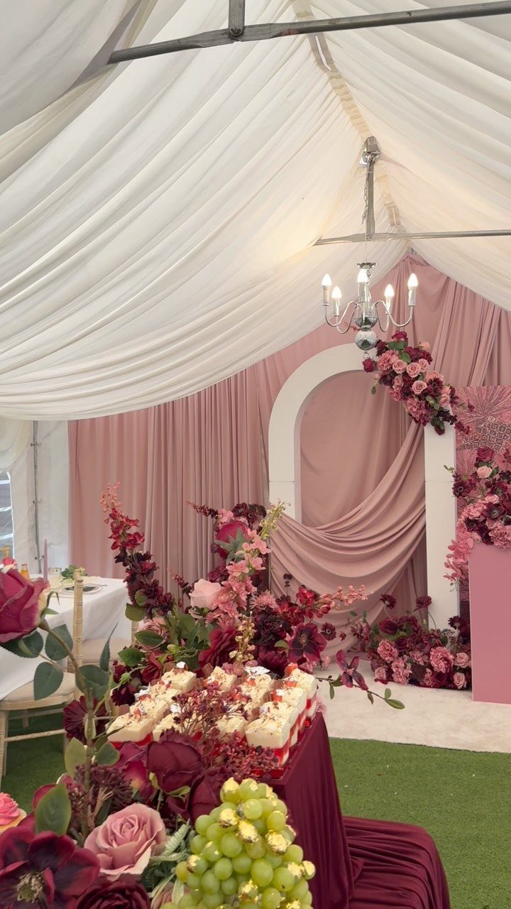
Blush drapery with burgundy flowers gives traditional pastels some drama. The pink keeps the room romantic, and the burgundy supplies the weight.
Let blush cover the big surfaces, like fabric and walls, and save burgundy for flowers and a few small touches.
A chandelier overhead adds glow, which helps dark florals read as rich instead of heavy. If burgundy feels like too much, use it in the bouquets alone.
11. Emerald Green, Deep Sapphire, and Burgundy
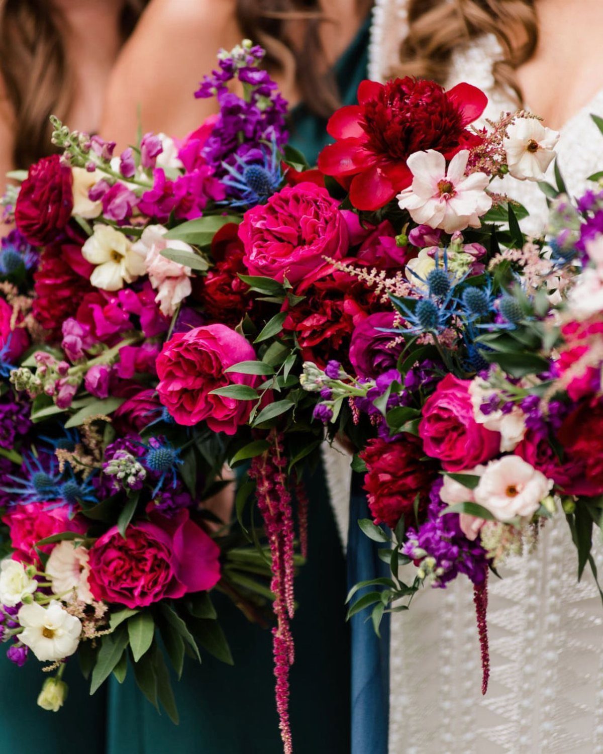
Emerald, sapphire and burgundy make the richest palette here, and it needs a neutral to keep it from getting heavy.
A white lace or ivory dress is the neutral I’d reach for, since it lets the deep jewel tones in the flowers stand out.
Choose one jewel tone as the lead and let the other two appear in smaller amounts. Put the bridesmaids in emerald and let the bouquets bring in the burgundy and blue.
12. Pink & Purple
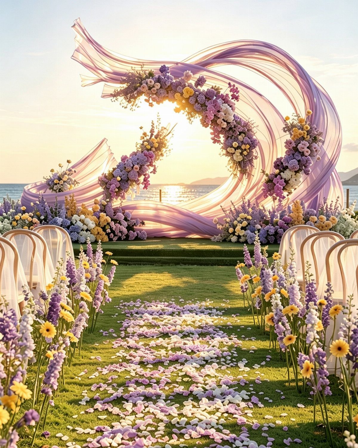
A purple fabric arch with pink and purple flowers makes a ceremony spot that feels soft rather than heavy, and the ocean behind it needs nothing added. White chairs keep the aisle clean so the color stays overhead.
Scatter petals down the aisle in the same pinks and purples to link the arch to the ground. Violet and crocus shades are the ones to look for if you want a true early-spring feel.
Choosing a Wedding Color Palette
Start with one anchor color, then add 2–3 complementary tones and ground the whole thing with a neutral. That formula keeps a palette from sprawling, and it gives your florist and stationer something concrete to match.
Your venue should set the limits before Pinterest does.
Take swatches or fabric samples to the space and look at them in its actual lighting, at the hour your ceremony will happen. Colors shift a lot between a screen and a room.
Trends can get you started, but I’d pick the palette that matches your own taste and the mood you want guests to feel once they walk in.
If a color feels forced when you picture it on the tables, drop it.
When you want a bold shade, pair it with a neutral so the room stays balanced. I’d rather see one confident color and a calm backdrop than three competing statements.
Spring Wedding Color Trends
Traditional spring colors remain a safe choice: blush pink, lavender and pale blue read romantic and soft, and they look right in a garden or any outdoor space.
Sage green, ivory and soft gray bring a more earthy, organic feel to both decor and attire. They work in bouquets, bridesmaid dresses and table settings alike, so one palette can cover a lot of ground.
For a garden-style day with soft light, I like a pastel mix drawn from the gentlest shades you’d find outdoors.
Crisp white plates, loose flowing fabric and flowers that look just cut from the yard keep that palette from feeling flat.
If you’re on a tight budget, a pastel palette is easy to scale. White basics cost little, and you can spend the color money on flowers alone.
Common Wedding Color Mistakes
Too many shades at once is the most common regret. The look turns busy instead of cohesive, so cap your palette and stick to it.
Skipping a venue lighting check is the next one.
A shade that looks perfect on a screen can shift a lot in an indoor room or under evening lighting, so I’d check swatches in the actual space before placing any order.
Matching every detail is the third. Mixing a few lighter tones in layers looks more natural and finished to me than matching the napkins, ribbon, flowers and candles to one exact color.
Keep the palette focused but flexible. That usually gives you a result that looks intentional and balanced, and it holds up in photos years later.
Frequently Asked Questions
What are the top spring wedding colors?
Blush pink, lavender and pale blue take the top spots, since all three soften easily and sit well against fresh greenery.
Earthy mixes like sage green, ivory and soft gray come next, and bolder floral tones such as hot pink with deep green suit couples who want something livelier.
What colors will be in style for spring 2026?
Look for gentle pastels sharing space with saturated, flower-inspired shades. Blush, lavender and pale blue stay popular, while sage, champagne, fuchsia, coral and sunflower yellow cover the brighter and earthier ends.
A saturated shade works best with something quiet beside it, like ivory or soft gray, so the room doesn’t feel loud.
What should I wear to a spring wedding in 2026?
Light fabrics in colors that sit well with the wedding palette are the safest choice.
Sage green, champagne, blush and pale blue all work for bridesmaid dresses, and light gray, sage and champagne are popular suit shades. Muted tones like sage and champagne pair easily with almost anything else in the room.