The ideas here run from a ribbon bow, which costs little but takes an evening of tying, to a watercolor estate illustration suite, which costs more than a flat printed template and pays off only if the art repeats across every piece.
Guest count decides a lot here: wax seals pressed with dried flowers take hand assembly, so they suit a small list, while a larger list does better with a vellum wrap or a flat foil design that a printer can run in bulk.
1. Floral Burst Wedding Invites
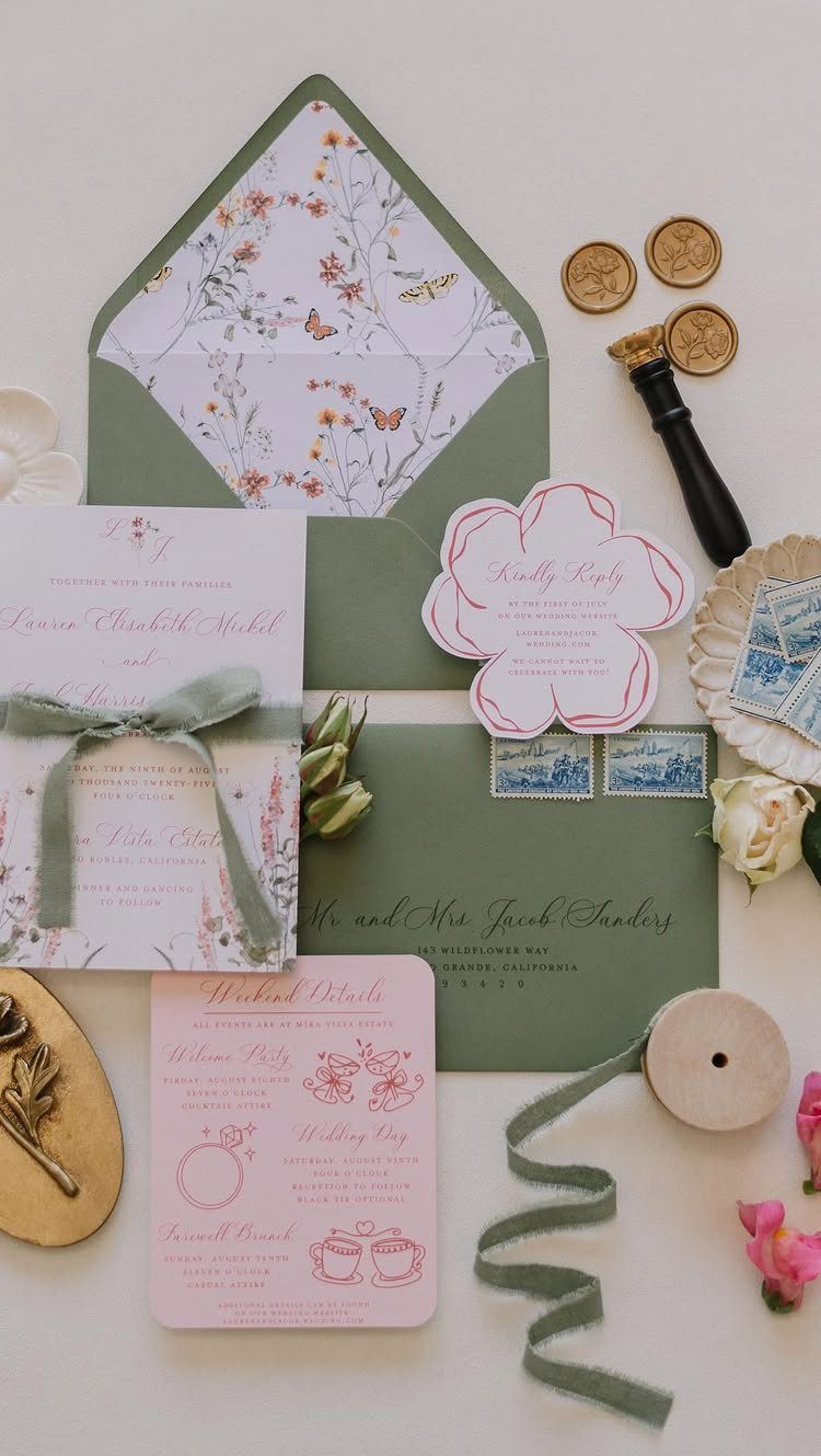
A floral print on the outside of the envelope is the cheapest way to get a big spring look, because the color shows before anyone opens a thing.
Pick one flower family for the liner and let the cards inside stay quieter.
Pull the pink for the detail cards straight from the bloom in the main art, then use a green ribbon in the stem color to bind the suite so the pieces read as one set.
I would copy that two-color logic: one accent from the flowers, one from the leaves, and nothing else competing.
2. Garden Square Greenery Wedding Invites
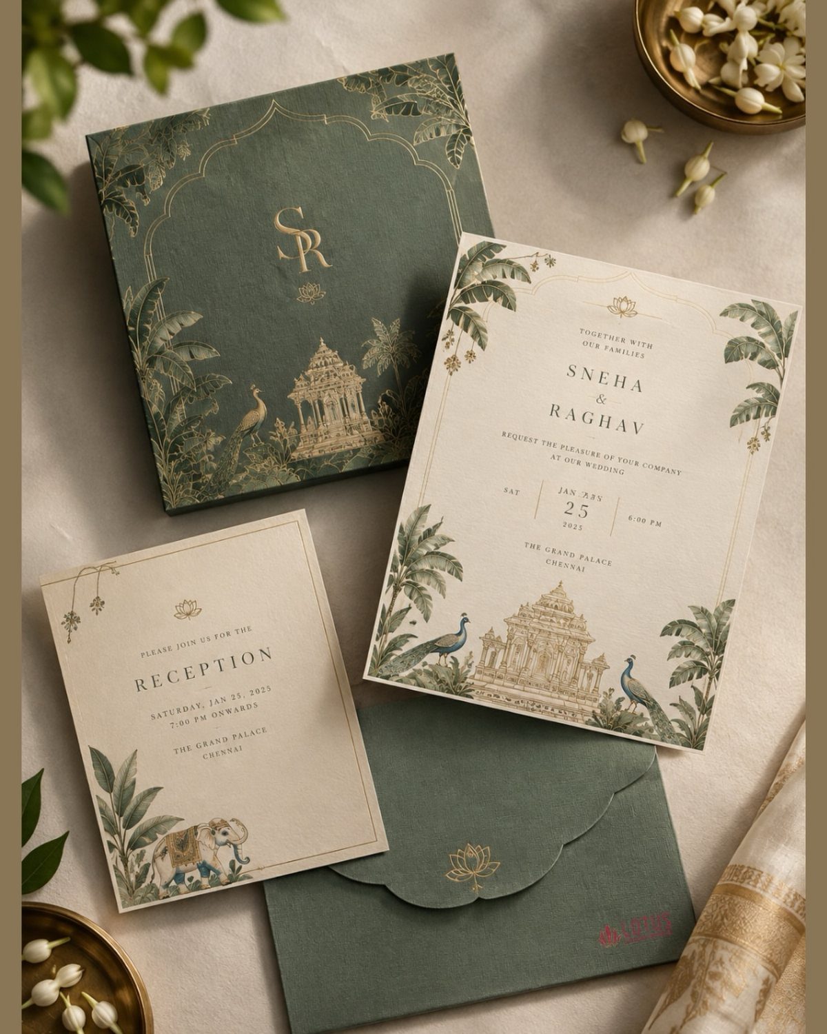
Greenery works best on invitations when the leaves do the decorating and the type stays calm.
Cream paper with green ink and gold foil reads formal without feeling heavy, and a box keeps the whole suite together; I’d pick it for a garden venue with a black-tie-adjacent dress code.
A box is a real splurge, and I would spend there only if the guest list is small. For a larger list, keep the botanical art and the reception card, and skip the box.
Keep the venue name in the biggest type after the couple’s names, since out-of-town guests look for it first.
3. Spring Flat Foil Wedding Invites
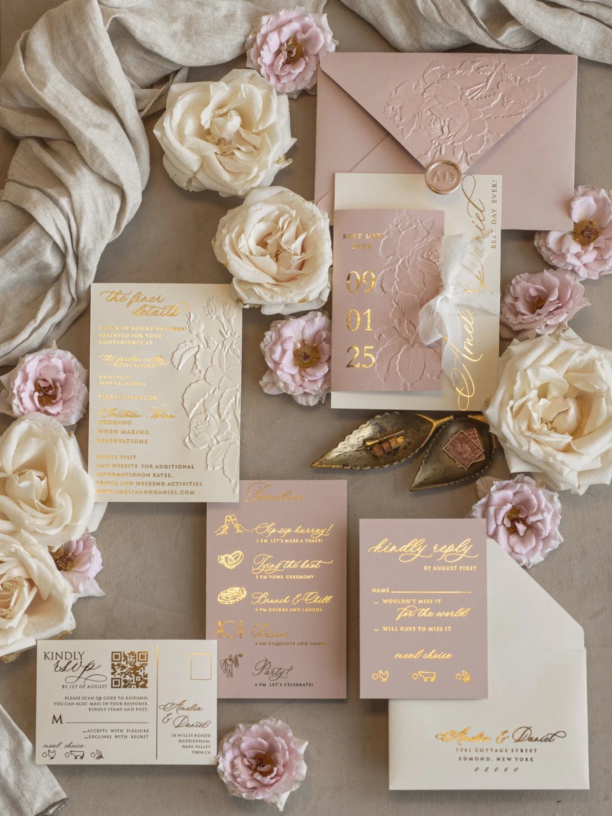
Flat foil keeps the shine of metallic stamping without the pressed-in texture, so the card stays smooth and the gold text sits crisp against soft pink and cream.
Pale colors with gold are forgiving; they look fresh in spring light and photograph well beside roses.
I would put the foil on names and the date only, and print the "kindly reply" card in plain ink to hold down cost.
4. Romance in Spring
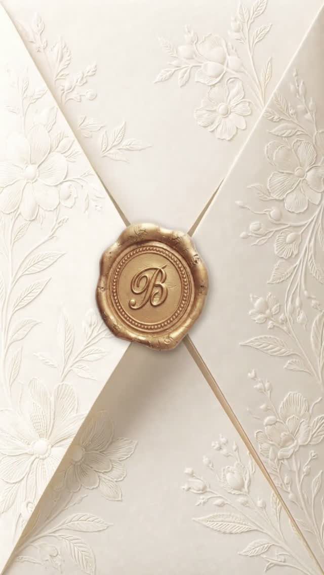
Embossed florals add texture you can feel before you see it.
I like this for couples who want romance without color. Choose one seal letter, the shared last initial or the first letter of one name, and let the embossing carry the spring theme.
5. Blue and White Floral Wedding Invites
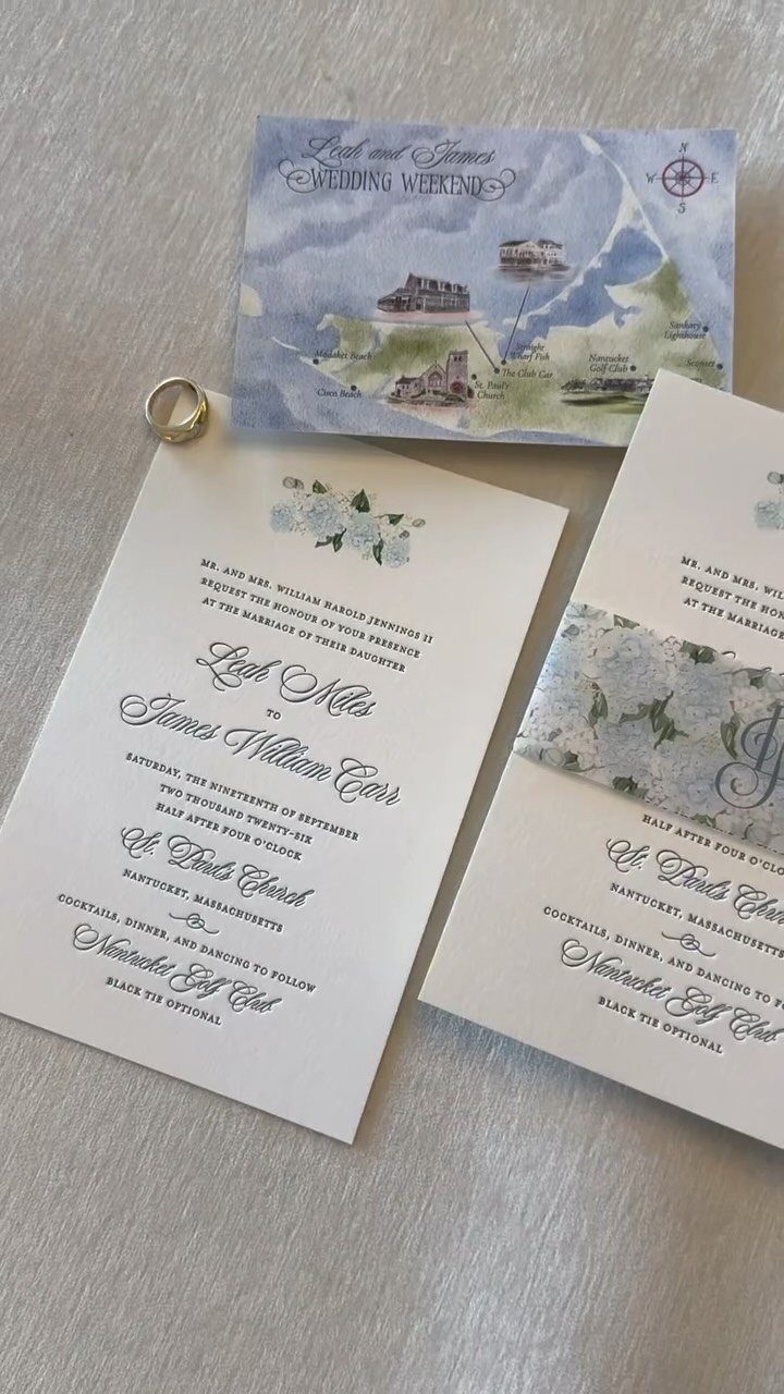
Blue and white feels cool and clean, which suits spring weddings that want a break from pink. A watercolor map is a smart extra: it gives guests the church and the island in one glance.
Print the map on its own card so the florals on the invitation stay uncluttered. A gold ring tucked into a flat lay photo is a fine styling touch, but your guests will only get the paper.
6. Watercolor Estate Illustration Suite
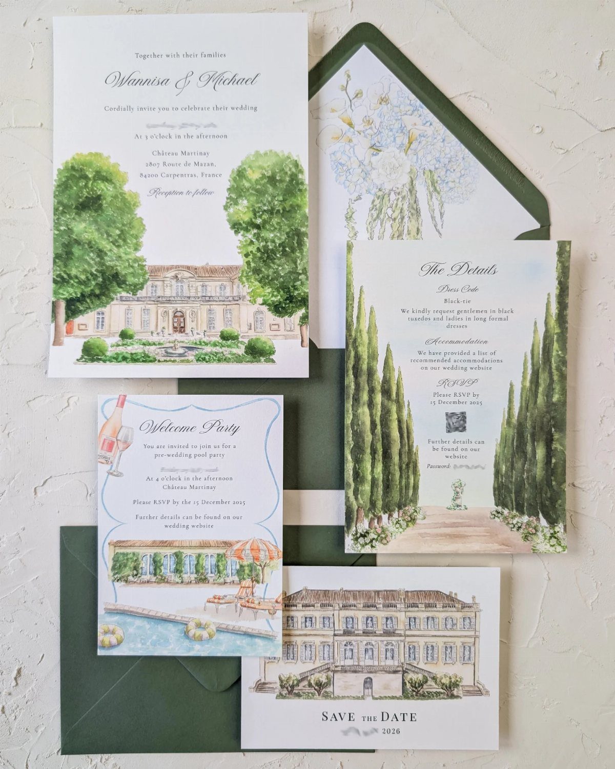
Painting the venue itself turns the invitation into a keepsake.
A chateau and pool in watercolor tell guests the setting before they read a word, and the same art can run across the save the date, the welcome party card and the invitation.
Dark green envelopes give the pale paintings a strong frame. Custom art costs more than a template, so I would reuse the one illustration across every piece to get your money’s worth.
7. Wax Seals with Dried Flowers
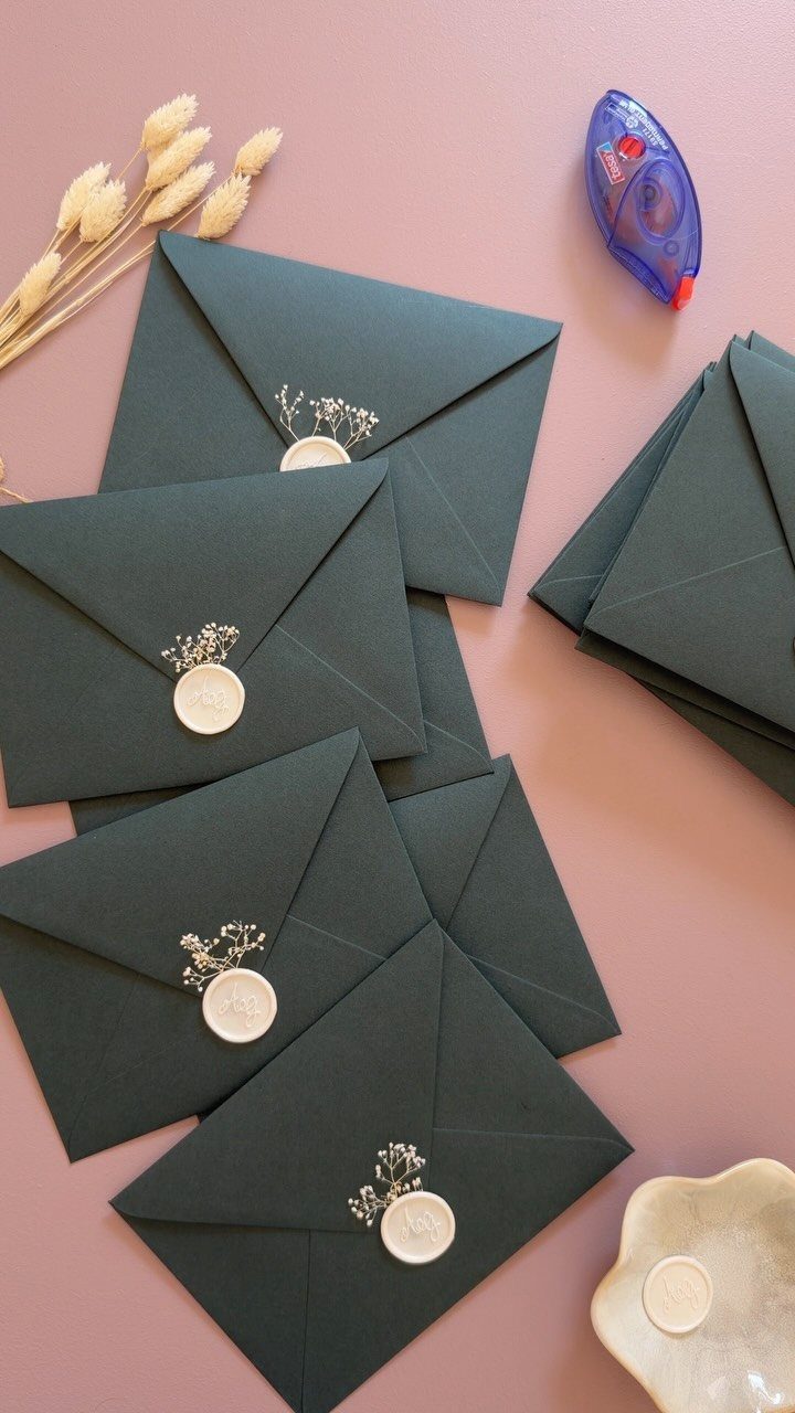
Dark green envelopes with white wax seals hold a pressed sprig under each dab of wax, so the closure becomes the decoration. White on deep green reads crisp, which means you can skip a liner and keep the paper plain.
I would choose this for a couple who wants a handmade feel on a small guest list, since every seal is applied one at a time.
Test a few before you commit, because a dried sprig can sit unevenly in cooling wax.
8. Invitations Tied with Ribbon Bows
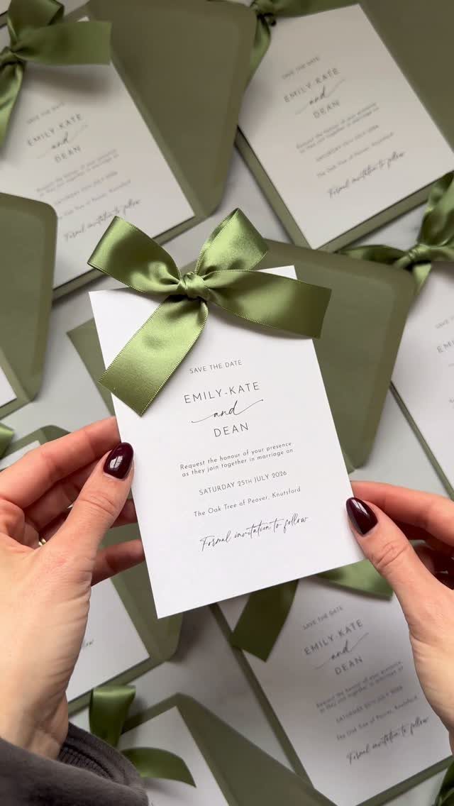
A satin bow in olive green turns a plain white card into something that looks gathered by hand. It also solves a practical problem: one ribbon can bundle the invitation with its detail cards so nothing slides loose.
Pick a single ribbon color and pull it from your palette; olive suits a spring wedding without fighting the white paper.
Ribbon is cheap next to foil or custom art, but tying each bow takes time, so set aside an evening with a friend and a pile of cards.
9. Vellum Wraps
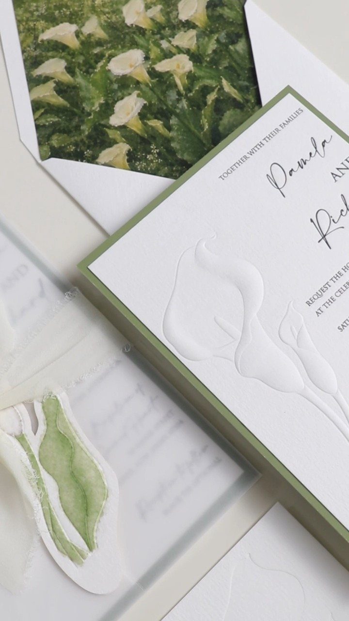
Vellum wraps lay a translucent sheet over the invitation, so the printed card shows softly through a layer of leaf art. The wrap is where the illustration goes, which keeps the card itself clean for names and details.
I like it with embossed paper, where the raised calla lilies stay visible beneath the sheet.
A vellum wrap works as a narrow band or a full cover over the invitation; either way, pair it with a floral envelope liner so the color shows when the flap opens.
Expect extra cost and assembly, since every suite gets one more piece.
10. Arch-Top Invitations
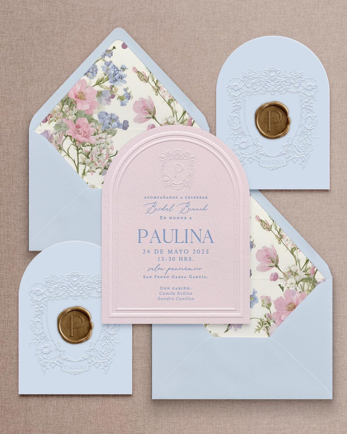
An arched top is the quickest way to make a card look unlike every other invitation in the mailbox. The shape echoes doorways and garden arbors, which suits spring.
Order matching arch-shaped envelopes if you want the curve to carry through, and choose floral liners and a gold wax seal for the finish.
Non-rectangular cards usually cost more than standard sizes, so keep the rest of the suite simple. I would check that the envelope fits before ordering a full run.
Frequently Asked Questions
What are the latest trends for spring wedding invitations?
For spring 2026, invitation designers are leaning on two looks: dense botanical illustration and soft, editorial color palettes, both a step away from the stock floral template.
I like a bolder take that stays controlled: a floral-lined envelope in one flower family, with quieter cards inside.
A lush design stays tidy if you borrow one accent shade from the petals and one from the foliage, then leave everything else quiet.
When should I send my spring wedding invitations?
Formal invitations go in the mail 8–10 weeks ahead of the wedding, while save the dates should land about 8–10 months before.
Spring Saturdays book up fast, so the early notice helps guests arrange time off and travel. Ask for RSVPs 4–6 weeks out, and a week after that deadline, nudge the guests who haven’t answered with a friendly message.
What should I include in my spring wedding invitation wording?
Add a seasonal touch, such as an opening or closing line that nods to spring, and match the formality of the wording to your venue.
After your names, give the venue the largest type on the card, because guests traveling in tend to hunt for it first.